The Design Process: Presidio Tunnel Tops
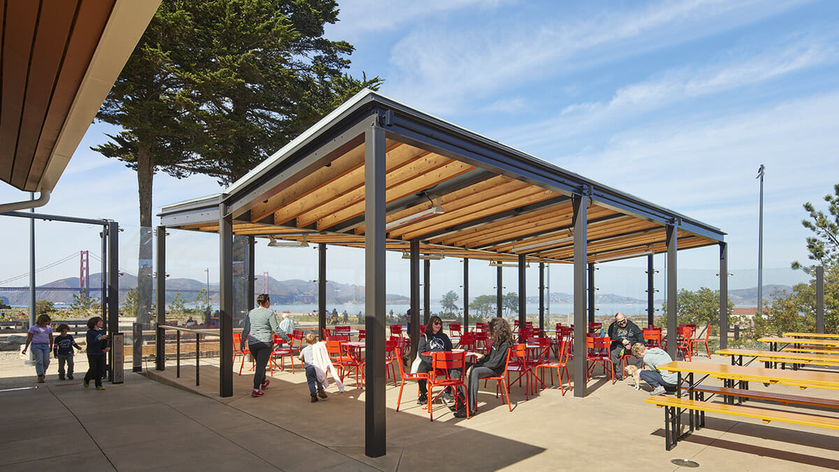
View from the Field Station looking out onto the Golden Gate Bridge. (Photo/Bruce Damonte)
A Conversation with Paula Cabot, Jennifer Devlin-Herbert, and Richard Kennedy. Moderated by Ellen McAmis.
At the foot of the Golden Gate Bridge, the Presidio Tunnel Tops is a major civic project transforming 14 acres of the San Francisco Presidio on and around the recently completed Doyle Drive tunnels. The newly designed park reconnects San Francisco’s Crissy Field and historic Presidio Main Parade grounds. The realization of this project is due to a partnership between Presidio Trust, the National Park Service, and the Golden Gate National Parks Conservancy. The design team led by James Corner Field Operations, with EHDD Architecture, worked to create a public space with the promise of being welcoming for all.
Below is an excerpted conversation from late March with Paula Cabot, Sr. Project Mgr. Tunnel Tops Project, Presidio Trust; Jennifer Devlin- Herbert, FAIA, LEED AP, CEO, Partner, EHDD; and Richard Kennedy, Partner, James Corner Field Operations; moderated by Ellen McAmis, Marketing Manager, EHDD Architecture, about the development and goals for the project.
Ellen McAmis: We’re really excited to talk about the Presidio Tunnel Tops, and I’d just like to start it off with a question to all of us here. The Presidio is an incredibly storied location in San Francisco’s history, and this project is a huge transformation of a key space. Can you tell us about the history, both of the space and how this project came about.
Richard Kennedy: I think the Presidio is an amazing place. It’s an amazing reserve of nature with hundreds of acres of forest overlooking the Pacific Ocean and the bluffs down in the Pacific Ocean. It’s the place where the Golden Gate Bridge connects in San Francisco’s peninsula. It’s a very historic place where the community of San Francisco began, and for decades, it was a military base that was active in the city. You can walk around the forest and trails and see the evidence of those past uses, on top of that, it offers just some of the most spectacular long range vistas of the Bay. The Presidio is also part of what is known as the Golden Gate National Recreation Area, which is the largest urban national park in the country.
It’s 80,000 acres that stretches up and down the coast around San Francisco and the Presidio is part of that national park. But because of its unique military history, even though it’s set within a national park, which is a fully public amenity, the Presidio hasn’t always been public, hasn’t always felt public. In the early military uses, it felt like a military base, and you didn’t feel like you could always just stroll in and access it. So when it transitioned from the military, the Presidio Trust worked very hard in making sure that the public knew that the park was for them. It really is a common ground that everyone in the city and across the country can come and visit and experience the beauty of the park and this part of the world. The Presidio Tunnel tops was perhaps one of the great demonstrations of this effort and this goal.
They defined this opportunity as what they called the new gateway to the Presidio, with the idea that it was both a literal gateway, a place to arrive and enter into the Presidio and get oriented to all that the Presidio has to offer. But also figurative in the sense of demonstrating that the Presidio was being unlocked and being opened up to an even broader audience, not just the audience of the nearby community that knew about the Presidio, but the audience more broadly across the entire Bay Area, and hopefully across the country as a gateway into this particular national park. That’s where our effort as a team all began.
Jennifer Devlin-Herbert: Given that framework of landscape and the building infrastructure that reflects the army based history of that land, the buildings were developed from the perspective of what an army base needs. More structure, formality, command and control, keep people out rather than welcoming people in. It’s hardly a building typology that is welcoming. Those six million square feet of space in buildings were really an important kind of visual marker of how welcome this place felt.
With the Tunnel Tops Project, while the buildings that are a part of it are really a background to the big Parklands and the Tunnel Tops Park itself, the buildings also had to work within the context of that park and national historic district with a very particular architectural character to many of the buildings that had to be respected and worked with. There were real challenges between creating a place that millions of people were going to be visiting, encouraging them into some smaller buildings with big impacts through programs and people, while also respecting the architectural heritage of the historic buildings.
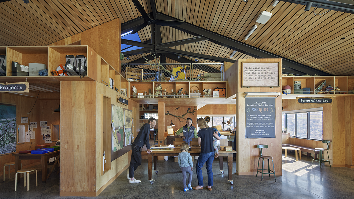
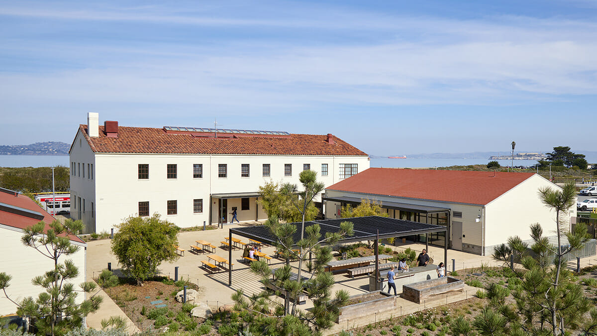
The newly constructed Field Station building is open to the public for hands-on exploration of interpretive exhibits about the Presidio’s rich ecology, history, archaeology, and more. (Photo/Bruce Damonte)
Ellen McAmis: All of you are talking about this initial concept of it being a new gateway and buildings that need to be welcoming and also this overlay of constraints, both of the site and of the history and of the various regulatory bodies. Within all that, maybe we could talk a little bit about how when we have this concept of welcoming, what were the initial conceptions of the audience and visitors to the park, and who we wanted to welcome into the park, who may have not been welcome before? Could you talk a little bit about that and how the conceptualization and the outreach occurred?
Paula Cabot: Well, I can tell you that one of the first times that I really felt that the landscape was welcoming us was when we took down one of the huge buildings behind the visitor center. And all of a sudden that whole area opened up. It opened up not just for the wonderful views, but just the way that the land sort of wraps around you. I felt that was welcoming. Anyone would feel that this was a welcoming space to begin with. So that to me was a really “aha” moment in the design.
Richard Kennedy: That’s interesting you describe it that way, Paula. We felt that way too when first stepping out on the site and seeing the horizon for the first time. Because of its beauty, I think everyone can grasp that this is a special place in the world. The horizon speaks for itself, and I think everyone involved knew that the view would always be the draw and the star of the show. Instinctually, we thought that the best way to draw people in was that openness and flexibility. What’s interesting is that when we started engaging with the community more specifically through community workshops, community participation exhibitions, and focus group discussions, it became clear that for people to really come out and want to enjoy the park, to feel welcome and invited, they’re looking for different welcoming cues to bring people in.
Having a big open green lawn was redundant, as there were already large areas of lawn surrounding the park with the main parade being one of them, but also Chrissy Field has an open airfield and a big open green lawn down on the bay. So through very early community participation and input, we started to understand that we need to create a mix of settings and diversity of places into the design that could speak to different groups and different interests. In doing so, we needed to create different invitations for use. So some areas are more open and exposed to the view, where people can lay out a blanket or kick a ball or play with their dogs. Some are more intimate and enclosed where a small group can come and just have an intimate conversation. Some areas were designed specifically for families, picnic tables and barbecue pits where people can come and have an afternoon with a group of friends and relatives and use it as their backyard. That kind of mixture of spaces was directly a result of the feedback we received and an expansion on the definition of what is welcoming and invitational.
Yes, and there was an elaborate and protracted process for understanding what those places and spaces should be. That had an impact on the buildings that were constructed in the park as well. In order to create that sense of welcome to all, what small but significant building space should be provided and where? While that feels like an abstract question to be asking, there were very intentional conversations over a protracted period of time that allowed for a lot of debate and discussion about how we were going to attract the broadest audience.
So the intentionality around what programs and building footprints and spaces should be minimally added to make this place feel like it was as attractive to a visitor from South Korea as it was a student from the Bayview neighborhood in San Francisco. There was a lot of debate around what were the public programs, what were the amenities that needed to be provided for that breadth of an audience. Keeping in mind that the city before Tunnel Tops didn’t really feel, even though it was open to the public, just by virtue of its building stock and the way the park was set up by its very nature, it didn’t feel very welcoming.
Richard Kennedy: This is a place for all Americans, not just for people in the Bay. And that ethos was constantly being reiterated throughout the entire process. Everything was evaluated against whether or not it was being inviting, being this kind of mixture of being flexible and allowing people to make it their own and occupy in their own way as any common spaces and public spaces do.
But also specific enough that there were ways that were familiar to use, and that made it intuitive and functional for people. That balance of creating an open, flexible invitation for any number of creative uses, along with the specific and intentional is evident for the landscape design – in the way the small intimate gardens and picnic areas and play areas are used relative to the open lawns and trails through the gardens as it is for the buildings. There are common areas that are for the public. The field station is this welcoming arrival point at the lower level and other common spaces in the buildings, and then more fixed spaces for deeper engagement with the Crissy Field Center program.
I think it must be said that the Presidio Trust and the National Park Service and the Parks and Conservancy were great stewards of that ethos throughout the whole process. The expectation is that ethos needs to continue as the park matures because design matters. You have to design the framework to invite and welcome and design places that people can use and feel comfortable in. But the people who occupy the spaces and manage the spaces, they too can contribute to a culture of welcoming over time. I think that I have great confidence that that ethos will prevail throughout the park’s history and keep it as an open invitational space for all.
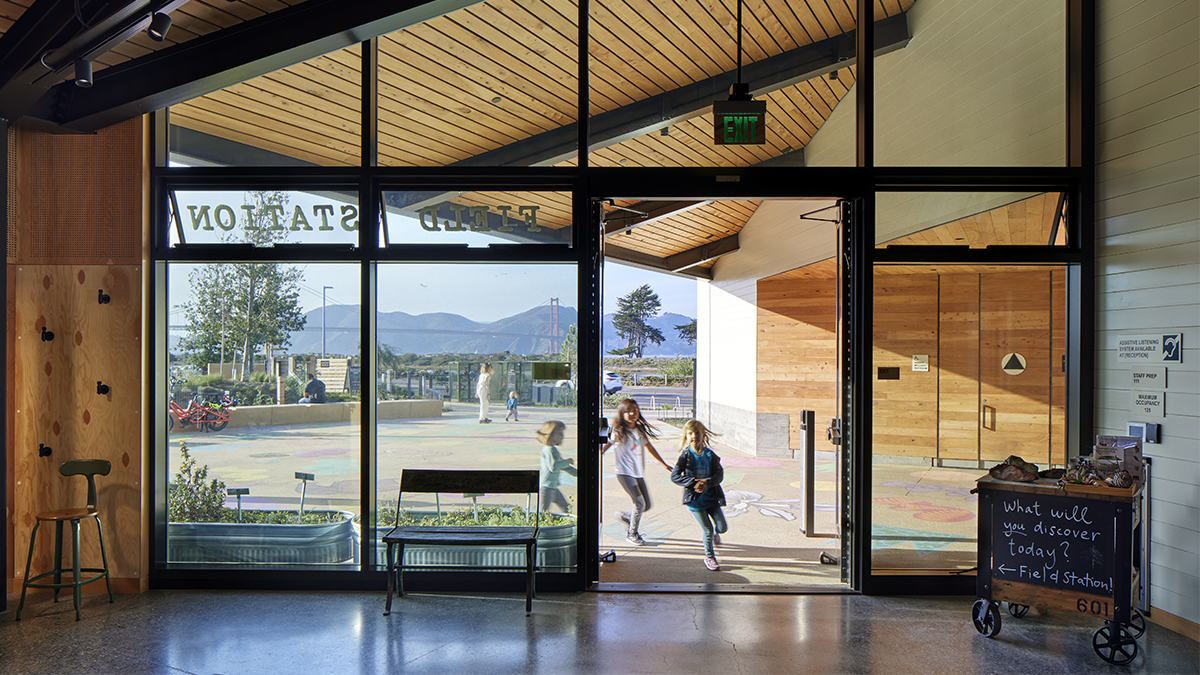
Views from the Field Station look out onto the Golden Gate. (Photo/Bruce Damonte)
Paula Cabot: I think what has also been tremendously successful, and it allowed the Trust to execute the vision that they had in welcoming diverse groups and communities, is that the space allows the programming for these groups to come in. I mean, the numbers are right, the size of the spaces are right. The activities that we envision are not confined to small areas, but can be expansive. And that in itself, again, with something that the Trust wanted, but the design was able to accomplish.
And now in our first year of being open, we’re actually being able to program and review these things and see how successful they are. And they are tremendously successful, and tremendously diverse. So again, you can talk more about the design process, but I think we’ve achieved what we’ve set out to, at least in terms of trying to create spaces that allow diversity and welcoming to other people.
I also think Richard, even how you situated the benches around the lawns and among the various paths. It invites people to sit down and think and be there. It’s a tremendously welcoming thing that allows one to just sit there and have a space to contemplate or enjoy their families or have a bite to eat there.
Jennifer Devlin-Herbert: I think there’s also a lot of credit to the Trust and the Conservancy and the Park Service for the intentionality of their outreach to communities during the design process to really engage in conversation with a great diversity of voices. They also went out into the community to hear the priorities from a really diverse crosssection of folks and neighborhoods. That input influenced a great deal of the planning and the thinking behind the buildings in the park and beyond. And JCFO did a remarkable job of the continuous evolution of the design with the input from the community.
Richard Kennedy: I think it’s interesting, Paula, that you mentioned the seating, because I think the whole aspirational ethos around the park was to create an opening and an invitation to Presidio and the National Park. But in design, we translated that into specific smaller invitations. And the benches and seating are some of those ideas and manifestations. We tried very carefully to make special unique seating people haven’t seen before. They kind of make you pause and say, “what is this?” That pause gives you time to reflect and consider how you might engage with the object. There are the large driftwood benches, the big sculptural benches on the Cliff Walk, those benches are as long as 90 feet in their longest segment, and they’re meant to host many people at one time. It’s not just a private bench, but something that you have to share and it’s sized to share. Because we do believe that the appeal of being in parks and being in cities is to be around others, to be in the mix of things. We tried to offer that same experience here in the park. It’s a place where you can come together and sit with strangers, but all collectively appreciate the world that you can see on the horizon, and in doing so, start to appreciate one another. Parks really are that kind of mixing ground, and the furniture is just one of the invitations that enables that to be legible.
Another example is the outpost, which is the lower level landscape designed around natural play and play in nature. That is an invitation for children and families to engage. You might not know the Presidio, but you’ve heard the buzz around this nature play space out near the Golden Gate Bridge. That is a way that we drew in enormous amounts of people. When they arrive, they see the playground, they’re amazed, their kids exert themselves, and then they realize there’s all of this other park land to explore and tap into. There is the potential for the broader public to experience a whole host of new environments, new offerings, connection to nature, connection to the city’s history, connection to our cultural history, just connection to the broader environment is huge and really exciting.
Paula Cabot: One thing that’s important to mention and that the Trust planned for, was transportation to the park. Originally, you may have had to change buses several times. But the Trust took this seriously. And so in the design, we had a transit center, but we just expanded the transit center so that people could actually come with their families and arrive in a reasonable amount of time. I think that pulling transportation into the equation in this design and into the project was key to actually getting people an easy way of accessing it, where before it was not so simple.
The 17,000 SF Youth Campus at the base of the Tunnel Tops bluff is a hub for children’s activities. (Photo/Bruce Damonte)
Jennifer Devlin-Herbert: Richard, I was thinking about the outpost, building on this theme of how to draw people into the park. Transportation’s one way to do it. The other is how do you create that singular destination to draw people in and the outpost has become that. Every two year old to fourth grader to grandparent wants to crawl through those tunnels. This helped the public get to know about the programs that they’re invited to and slowly it became more of a public invitation to explore more.
Richard Kennedy: That’s right. I think we all had the instinct that providing a space for children would allow families and other people to come. We’ve learned in hosting public meetings, that if you want parents to come, you have to have space for children to keep busy. But it was the Presidio Trust who took on the challenge to allow for the play to innovate and become a fresh experience for children that was specific to this environment. It was the ethos and culture and quality of the national park that took the initiative because playgrounds are notoriously difficult to design and work through. There was a deep belief that this would create a bond between children and the natural world. Play was the best conduit to that goal, but not just any type of play. It’s all made out of natural materials. It’s inspired by narratives from the park. The nests that create tree houses are inspired by the bird nests from birds that actually build nests throughout the park. There’s intentional thought behind all of it, from its material characteristics, informal construction, to the softness of all of the detailing gives this overall impression that you’re playing in nature. You look around and even the play spaces have some of the best views of any playground in the country. The hope is that the uniqueness of the scenery creates a memory that builds that bond with nature over time and the park would become a gateway to a lifetime of connectivity to national parks, to nature, and the earth.
