Brand is the New Black
Designing Workplaces with Identity
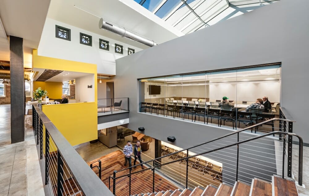
Sasaki designed Havas/Arnold Worldwide’s brand into every detail of their new Downtown Boston space, creating an environment that clients and employees identify with, and where they can do their best work.
By Meredith McCarthy, Architect, Sasaki, photos courtesy of Sasaki
You may have heard a lot about workplace design’s favorite buzzword: brand. Brand, as we have come to know it today, can be defined as the unique, distinctive characteristics of a business. It is the articulated identity of an organization based on a carefully curated catalogue of ideologies and philosophies around which that corporation has been built. It is the expressed personality of a company committed to a set of core missions and goals. A company’s brand is its lifeblood. And today, it’s not just customers, but also increasingly employees who are expecting corporations to live up to the high standards they set out in the world. What it really comes down to is — if you’re going to talk the talk, you’d better walk the walk.
But the question remains, how does that ambiguous noun, brand, translate into the design of a company’s physical space? For that, we have a different definition of brand: the act of leaving a mark. A well-branded workplace is the physical manifestation of an abstract persona. Its design must take into consideration the attitudes, ideals, and intentions of a company and create a place that not only supports them, but nourishes them and allows them to thrive. A branded workplace must go beyond a logo or a color scheme and become the essence of that corporation. The space must truly live the brand. It must create an ambiance which starts at the front door and weaves its way through every square inch of the floor plate and beyond.
Herein lies the true importance of a branded workplace: it can transform the way in which that company operates. Sure, it is wonderful if you walk into a workplace, let’s say an Apple Store, where the environment has captured the spirit of its occupants. But what is truly astounding is that a designed environment can strengthen that character, embody that soul, and improve upon it. A well-branded workplace leads to more satisfied employees who are more engaged. It boosts productivity and improves ideation and innovation. It fosters creativity and ingenuity. It changes a company’s perception from the outside, which often results in a drastic increase in recruitment and retention of both employees and clients. A well-branded workplace can enable a corporation to achieve its maximum potential.
So how does one achieve a well-branded workplace? At Sasaki, we believe it takes a strong programming effort, early in the process, with all the right stakeholders to arrive at the vision for a company’s future. How does a company want to work? How do they want to interact internally and externally? Where do they see their business going in the next few years? Getting the answers to these questions helps craft a concept that personifies an organization’s ideals about how they want to work and can help them transform their operations to achieve that vision. Let’s look at two recent projects where strong vision statements about brand-led to incredibly successful outcomes.
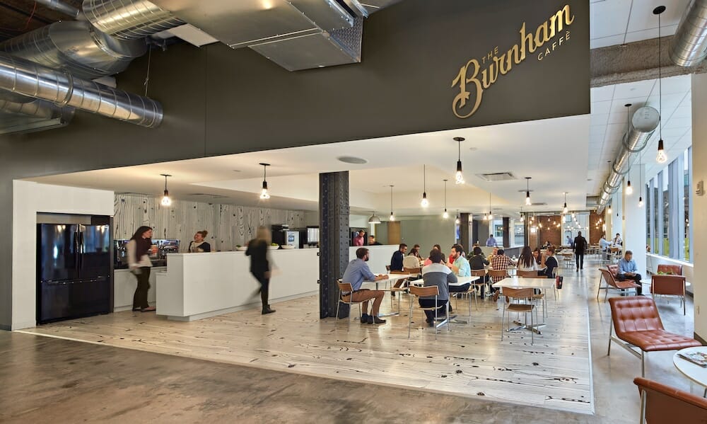
Designing brand into workplace includes logos and colors, but it’s more than skin deep — a well branded workplace uses spatial elements to drive employee engagement.
The “Holy Sh*t” Moment
Brand is about leaving a mark, because as the saying goes: you only get one shot at making a first impression. That was the task at hand while designing Havas/Arnold Worldwide’s new headquarters in the Burnham Building at the heart of Boston’s Downtown Crossing. Before we go on, we should mention, we don’t worry about sounding crass when it comes to designing remarkable space. So when the leadership at Havas/Arnold presented us with the provocative request of creating a space that “upon entering makes you say ‘Holy Shit!’” we were immediately up for the challenge.
More than simply asking us to stretch our design skills, Havas/Arnold was telling us they wanted to make an immediate yet lasting impression on their visitors. They wanted their space to start with a bang. Pam Hamlin, global president of Havas/Arnold Worldwide, when asked about the guiding mantra for the design and build-out said, “When people get off the elevator and walk into our lobby, we want them to say, ‘wow—I need to work with these people,’ whether they are clients, prospects, or employees. ’Wow’ was our benchmark.”
That’s a tall order for color and a logo to perform on its own. That “wow moment” needed to be spatial. It needed to have depth and layers and detail. It needed a strong design concept. And so when you, the visitor, walk out of that elevator lobby on the top floor today, you are met with an immediate expanse of space up and down, a stream of natural light from the beautifully restored skylight above, a direct view into the main conference room, and a material palette rich with texture and color. All of these elements come together to create a series of spaces that enliven the open, bright, and forward-thinking atmosphere Havas/Arnold has come to exemplify in their business brand. As Hamlin puts it, “for the first time I can say that our space actually reflects what we do within these walls.”
That wow moment could have been a single design statement, a burst of energy and brand that captured attention and imprinted an impression of the company on its visitors. It could have been The Big Moment in the design. But a successful brand doesn’t stop at the reception desk. It carries through the entire office. Havas/Arnold was very aware their workplace had to emulate their style and philosophy of collaboration not just in the lobby but in all their work spaces.
Havas/Arnold Worldwide is a leading global ad agency that represents major brands like Fidelity, Jack Daniels, Progressive Insurance, and a whole host of other household names. They are a collaborative group who works best when bouncing ideas off one another. They also value a transparent business model, one where their leaders sit among their teams and integrate themselves thoroughly into project groups. The design of their new headquarters needed to support that kind of working style. The 125,000-square-foot plan is oriented entirely around group work, utilizing a split core so the center of the space can house copious conference rooms and collaboration spaces that spill out into spacious corridors that take on a room-like quality all unto themselves. The design team was deliberate in creating a seamless flow in support of Havas’ goal to go from an 85% enclosed office to a full open floor plan.
Today, agency leadership is fully integrated into the open floor plan, sitting side-by-side with the rest of the workforce. To help this succeed, there are two alternative seats for every individual desk—some more collaborative and others for more focused work. For the creative agency, collaboration is the secret sauce for cultivating constant innovation, so creating a space where employees are excited to come in and team up every day was understandably imperative.
When walking through the space today, one can’t help but feel a vibe and an energy that keeps Havas/Arnold moving forward. The design of their new work space reflects their creative business ethos, supports their way of work, and furthers strategic goals— translating to immediate new business and personal growth. Hamlin happily reports, “from a business standpoint the office reflects the direction and future of the agency. It’s been a catalyst not just for emotional charge and pride, but also for driving business impact.”
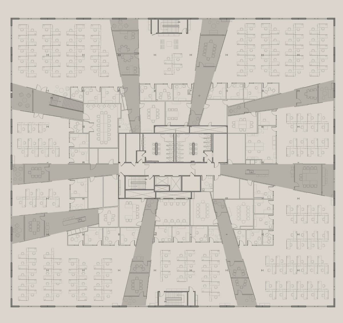
Sasaki used rays of light emanating from the core of the building to divide OSRAM’s space into distinct “neighborhoods.”
Designing With Light
While making a strong impression is one way to capture a brand, another is to interpret the true essence of a company. Enter: OSRAM Americas. OSRAM is the world’s largest developer and producer of lamps and lighting systems. They’re on the cutting edge of lighting design and their older workspace wasn’t helping them stay ahead of the curve. They needed a headquarters that could support their need for quick collaboration and fast research and development. But most importantly, they needed a space that spoke to their customers and employees alike, and told their story of leadership, innovation, and design in the lighting industry. They wanted a workplace that illuminated their brand. Therefore, when we met with them during our early visioning work session, they challenged us with one simple task: design with light.
“Designing with light” could have been taken at face value, and we could have used a myriad of lighting styles, fixtures, and controls to achieve a space that spoke overall to the display of light. But OSRAM was looking for something more integral to the way they operate. OSRAM doesn’t design and manufacture light fixtures. They develop the inner workings of lighting components that go into light fixtures. Therefore, they didn’t just want to show light, they wanted to be light. As a result, we dug deeper into how light behaves, how it reacts to certain stimuli, and how it navigates its way through space. The final design was based on rays of light emanating from a central core. It organized all of OSRAM’s communal and collaborative spaces into “rays” that broke up the open office into nested neighborhoods. The rays bifurcated the space and allowed for collaboration to happen frequently and quickly throughout the entire floor plate, supporting the need for employees to quickly develop new ideas and move products toward markets faster.
When asked about how the new workplace supported OSRAM’s changing business model, Jes Munk Hansen, former CEO of OSRAM Americas and President of OSRAM Sylvania, commented, “A product used to last for ten years before it lost market relevance due to new innovations. Nowadays, that time period is less than a year. The speed of new product development has absolutely exploded. That kind of dramatic technology change requires a different organizational structure and more importantly, a completely different culture of collaboration, transparency, and speed, speed, speed! Moving to this building signaled an absolutely dramatic, rapid change: we went from a static environment to a very fast-paced environment, and the impact shows. We used to announce less than ten new products a year and our previous facilities and processes were set up for that. This year we launched 250 products.”
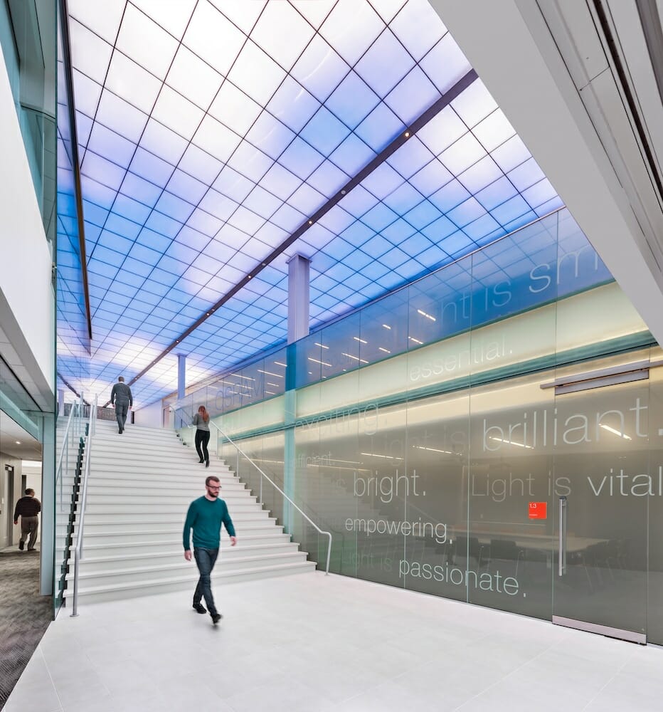
OSRAM’s new North American HQ conveys that this company is entirely oriented around exploring new paradigms that will further increase their business efficiencies and speed to market. But it also resembles a laboratory of lighting technologies and innovations. The design of light doesn’t stop at the organizational arrangement of spaces around the rays. It infuses itself into the lobby and entry sequence with a glowing ceiling that pulls you in from the exterior, creating a striking burst of illumination upon arrival. It flows into their training center where OSRAM welcomes in clients and industry partners to educate them on the latest developments in lighting. It permeates the color and material choices of what is in a ray versus what is outside a ray, accentuating the allure of the collaborative spaces and the push to bring everyone together to innovate—essentially bringing people out of the dark and into the light. It even integrates itself into the graphics and signage throughout the headquarters with a wayfinding strategy completely centered around lighting language.
OSRAM’s branded workplace allows them to physically express their position and their stature in the lighting field. “We’re known as leaders in training in the industry,” states Hansen. “It’s a big part of our brand. With this in mind, we determined that we needed a training facility in the heart of the building. Customers love it. They love being at the physical core of all the work we do. The best compliment I’ve received when a customer walked into our striking entry is ‘when you walk in here, there’s no doubt that this is a lighting company.’”
Brand is the New Black
Clearly, as architects and designers, we can make the case for brand as an element of beauty, of quality, of renown and prestige. But, for the end-user, there is a much more important business case for brand in the work environment. These projects showcase the possibilities of successfully incorporating a company’s brand into every square inch of the design of their workplace. Both OSRAM and Havas/Arnold have experienced major improvements to productivity, employee satisfaction, recruitment and retention. Both have transformed their business operations to become more efficient while staying true to their culture. And both were able to achieve fantastic success while remaining within their budgetary constraints for their respective headquarters’ projects. A well-branded workplace does not have to come at a monetary premium; it simply requires a strong vision and attention to detail throughout the design.
Brand is not a new workplace design fad. It’s not a trend that will be replaced when the next big thing comes along. And brand cannot simply be a color, a logo, a product, or a decorating style. It is not an afterthought. Brand must be fundamental to the concept around how we design and plan for space. Companies must embrace their core values and stand by their brand in all aspects of their operations, including their physical workplace. Design must not only respond to how companies want to operate and want to portray themselves to their employees and their clients, it must enhance those opportunities for organizations to put forward their best selves every single day. The space must breathe the brand from the big ideas to the minute details. Brand is not superficial. Brand is not appliqué. Brand is a bold, impactful statement. Brand is the design.
