Kronites Unite!
Relocating and Consolidating into Kronos’ New HQ
With a spirit of inspiration and innovation the employees of Kronos are proudly part of a culture driven by vision, purpose, and commitment. Kronos has created a special place to work that resonates with their employees, fondly nicknamed “Kronites.”
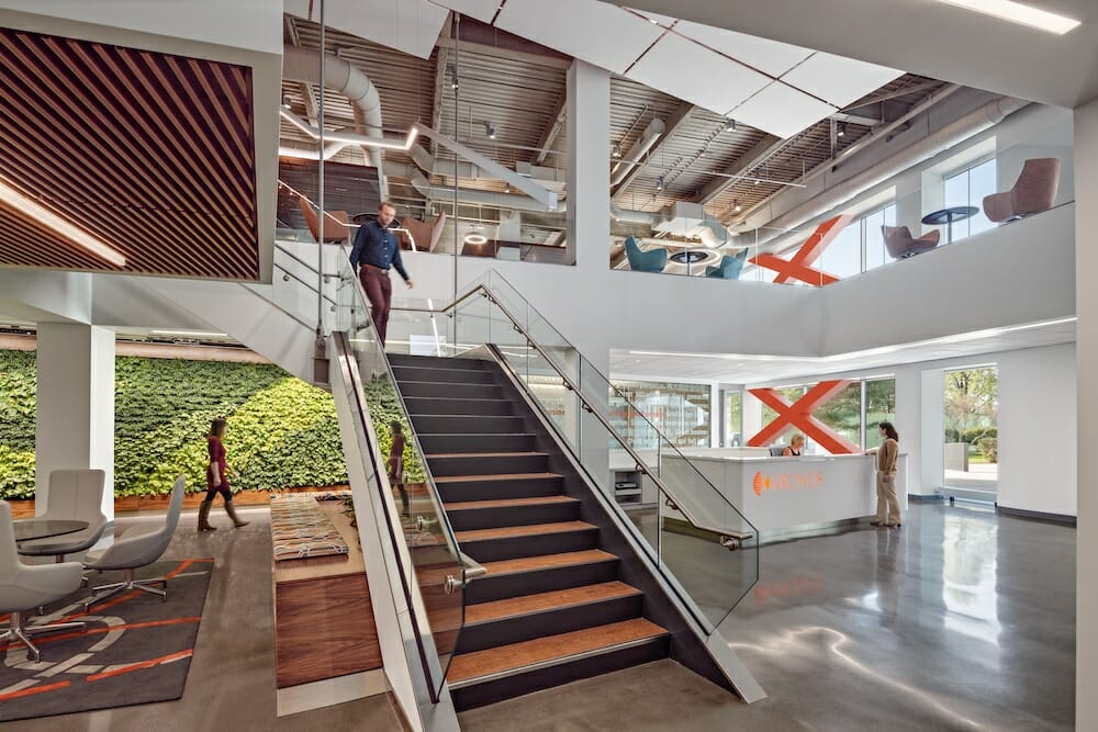
Kronos’ new headquarters consolidated three former sites, bringing 1,500 employees under one roof in Lowell, MA to increase collaboration and innovation.
By Amy Lalezari, Director of Client Services, Environments at Work; Photography by Robert Benson
And Kronites care about more than just work — they recognize the need to maintain a healthy work-life balance. Kronos has been recognized eight times as one of the Boston Business Journal’s Best Places to Work and for the second consecutive year as one of the healthiest employers.
Founded in 1977 as a manufacturer of time clocks, Kronos has evolved into a global leader providing software and cloud applications for workforce management and now employs over 5,000 people worldwide. The $1.2 billion company occupied a 330,000-square-foot office in Chelmsford, MA that it called home since 2000. By 2015, with their explosive growth, it was clear that Kronos needed to think strategically about its real estate footprint. At the time Kronites were spread out over three buildings — the separation diminished face-to-face meetings, disconnected key functions, and created negative cultural perceptions about the “haves” and “have-nots.” Massachusetts’ largest technology employer needed to bring its 1,700 Massachusetts-based Kronites back together – under one roof – to break down the silos that formed over time and foster the deep connections inherent in their culture.
The goal of the new space was to consolidate multiple locations to one central location, accommodate tremendous growth, and demonstrate a strong commitment to employees. Kronos is keenly aware that its workplace serves as an important tool to attract and retain top talent. They needed to create a desired “place” for its current and future workforce.
Kronos was an early-adopter of the open office concept, but, due to limitations and space constraints in their current buildings, Kronos experienced multiple roadblocks fulfilling workplace strategy goals, including providing ample common amenity space and collaborative meeting space. They also desired more quiet focus zones and social community spaces for Kronites to effectively work. It was even difficult to effectively incorporate workplace technologies within the existing space. Kronos needed to move — finding the right location and space was critical.
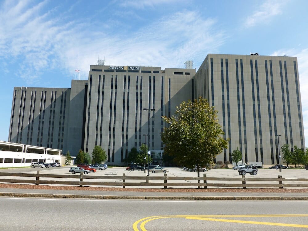
Cross Point consists of 40 floors across three towers.
Location, Location, Location
Kronos needed a great location that worked for their staff, had room for growth, adequate parking, and the right overall feel for their brand and team. Multiple sites and buildings were considered over a two year period including locations in Waltham, Burlington, and Lowell; in the end Kronos found its new home in Lowell’s Cross Point complex.
“We were looking for our space to inspire and engage our employees. We wanted it to offer some of the comforts of home while supporting work-life balance,” said Jonathan Proffitt, Vice President of Global Real Estate for Kronos. Touted as a next generation workplace, Cross Point offered 1.2 million square feet to accommodate Kronos’ future growth and a comprehensive study showed that the majority of Kronites would have a shorter commute to the new building.
While the new site met the overall space requirements, the building — in its current state — lacked Kronos’ vibrant energy. Built in the 1980s, Cross Point was an industrial-looking structure that posed quite a design challenge. The exterior, a cement-clad, fortress-like façade did not match Kronos’ desire for a warm, welcoming world headquarters. Inside the towers, special attention needed to be paid to integrate technology, increase natural light, and create flow from one building to the next.
Key Design Principles
- Equal access to natural light & amenities
- Consistent in approach
- Differentiate where impactful
- Provide one meeting room seat for every two people
- Choice of collaboration spaces
- Design choices with balance & flexibility
- Visibility & connection among Kronites
- Reinforce “Customer First” and the brand
Employees First
The team saw only one way to approach the project: employees first. Understanding the needs and desires of the staff was critical before moving forward with the design. And what better way to find out what employees needed than by simply asking them directly?
Packard Design, a global interior design and consulting practice, the team at Environments at Work, a contract furnishings service provider, and Delorey Contract Interiors, all worked successfully with Kronos on various projects over the years — our experience with the Kronite culture aided in understanding the unique aspects of the project. Speaking about the research-based beginnings of the project, Susan Packard, Principal of Packard Design said, “We facilitated listening and visioning sessions to ensure their needs and ideas for the new space were being captured to ensure we were on target with their vision and expectations.”
This empathetic research took various forms, and it all took place early in the project. The team created advocacy groups to act as business unit liaisons to the projects, held town hall-style forums with graphic illustration facilitators, and hosted furniture mock-ups with our team to allow employees to test products and provide feedback.
Using a collaborative approach to compile and assess feedback enabled the team to quickly translate information into appropriate design intentions. These early steps resulted in a smooth project that kept everyone accountable, excited, and aligned throughout the project. Based on the feedback and insights gained by the employee engagements along with Kronos’ workplace and leadership strategy, a clear set of business drivers were solidified. From there, the team identified and articulated the Key Design Principles for the new workplace at Cross Point.
Dramatic Design
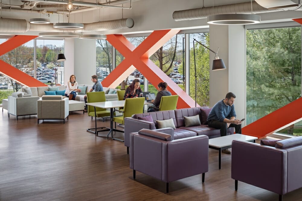
Packard Design was tasked with transforming Cross Point into a beautiful, light-filled, innovative space. The dramatic transformation began with peeling back the 18-inch perimeter cement face of the building and replacing it with a glass wall. The result: now natural light streams into the interior creating a space that is open and inviting. Bright views now connect the inside with the outside..
A new, dedicated Kronos entrance was created with security and a front desk, allowing Kronos to welcome both employees and visitors the “Kronos way”. Upon entering, you are greeted by smiling security attendants with a welcome station that employs tablets to check-in and a wayfinding system that is both user-friendly and reinforces the high-tech company feel.
Kronos’ space in the CrossPoint complex spanned two towers and connected via two of their 17 floors. To maintain a sense of continuity and visibility, “crossover” spaces were created to connect one tower to the other. The spaces are connected by employing wide aisles, glass, and clear wayfinding. Walking from one tower to the other is virtually unnoticeable through these crossovers.
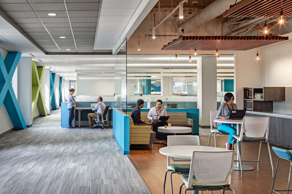
At the core of this collaboration was creating a sense of place and community within the new workplace, designed to blend the line between home and work. A common, dedicated amenity floor was created for all employees. Each floor employs unique branding using colors and visual cues for wayfinding and community building. Spaces are also branded using fun, memorable names — The Lawn, The Park, The Yard, Sidewalk, and Library — to create a shared vocabulary among staff. Collaboration spaces dot the open workplace plan and glass is used everywhere to create an open feel with lots of natural light.
The results are incredible. Kronites who telecommuted in the past are returning to work in the office, simply because they want to spend time in such a great space. Now there is intuitive technology throughout the space that’s easy to use and increases productivity. Overall there’s increased transparency inside and out, there are more places to get together like collaboration spaces, impromptu spaces, private spaces, hubs, café, booths, and informal soft seating.
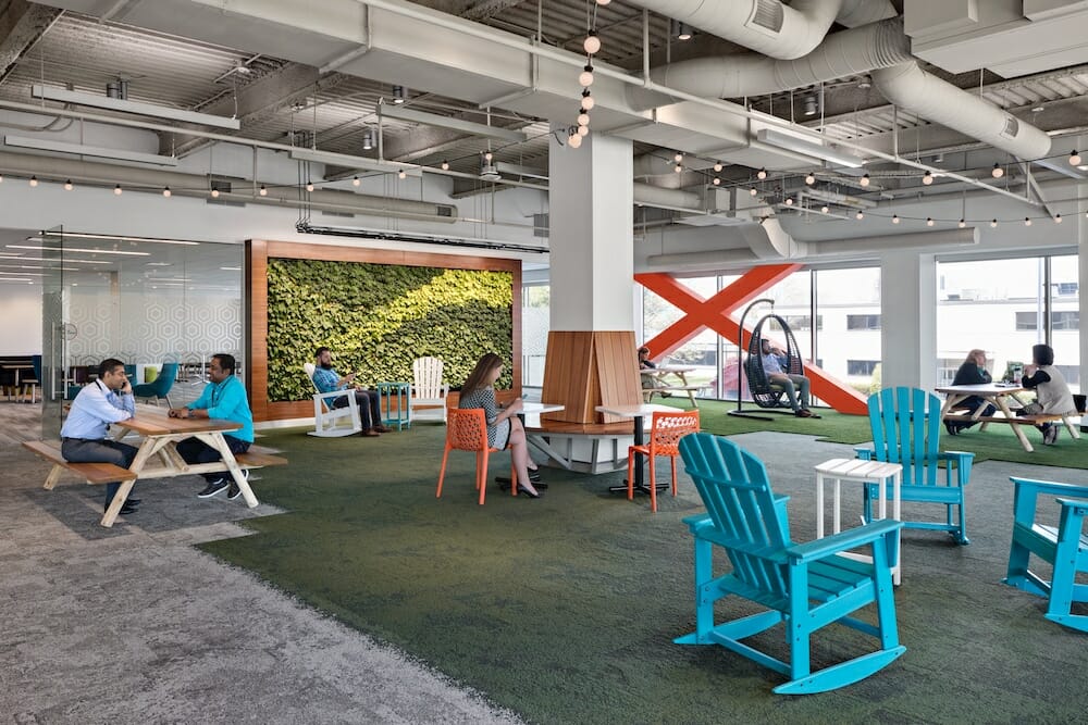
The average work day has grown longer over the years. When you can offer your employees spaces to let loose and release some of the day’s stress, it increases the energy in the office. Kronos has a gym and its game rooms are outfitted with pool tables, air hockey, and foosball tables. The “Hub” boasts colorful Adirondack chairs, grass carpeting, and natural wood elements so everyone can enjoy the benefits of feeling outdoors during the work day. These areas are always buzzing with energy.
“The café spaces we designed could serve not only as spaces to enjoy a meal, but as spaces to sit and have impromptu meetings and moments to yourself,” Susan Packard notes. “We wanted to add elements to these spaces that kept them open and light. We used different materials and textures to spice up the space. We had natural wood finishes, painted metals and stone finishes.”
United
Open communication and a solid change management process throughout the entire project resulted in few surprises among employees and a very satisfied workforce. The outcome is an energetic and well thought out space. Occupied starting in Summer 2017, feedback is in its infancy, however, the vibe at Kronos is infectious. The response has undoubtedly been positive! “The reaction from the employees has exceeded my expectations. The open space, the common areas…having everyone together in one building…they say ‘I love it’…” said Aron Ain, CEO of Kronos.
I am so proud of the collaborative, innovative, and passionate culture we collectively cultivated and upheld throughout the process. The new workspace plays a major role in reinforcing the brand, employee culture, and the customer experience. Kronites continue to be inspired in a space that works for them while supporting the company’s business goals. The energy and spark is alive across the company — Kronites have united!
