Connecting a Vertical Campus
Designing the Workplace of the Future with Adobe
A few years ago, the employee journey at Adobe’s downtown San Jose headquarters looked much different than it does today. A major transformation resulted in a workplace of the future that supports employees’ varying work modes throughout their day.
Images courtesy of Gensler and Adobe
By Natalie Engels, Design Director & Principal, Gensler
Built in the 1990s, the campus’ original aesthetic and functionality were on trend for its time. Upon entering the campus, you would have been welcomed in a formal lobby with elegant floor-to-ceiling polished granite. If you rode up the elevator to any of the work floors, you would have found all of their employees working in their own offices. And, if you were looking for a place to socialize with fellow employees, a typical break room and cafeteria were your main options. Adobe’s brand was highlighted through framed artwork on the walls but the space itself did not express the collaborative and vibrant community the company had created.
With the success of Adobe’s new business model — a dramatic pivot from selling software CDs in boxes to now a subscription, cloud-based model — a workplace change was needed to represent the company they had become. Adobe’s evolution meant that work styles became more collaborative than ever before and recruiting the right talent to support their changes was crucial to the company’s success. They wanted a headquarters that enabled their brand to shine — a connected space that supported their collaborative work processes and attracted new talent.
Over the past five years, Adobe has seen over 60% growth in employees globally and a 37% increase in employees at their San Jose headquarters alone. With such fast-paced growth and the need to attract new talent, it was crucial that Adobe’s mission and culture was celebrated in their space. Adobe gives everyone from emerging artists to global brands everything they need to design and deliver exceptional digital experiences and they believe the workplace should do the same for their employees by inspiring and sparking innovation.
Enter Gensler, a leader in workplace design, to reimagine Adobe’s headquarters in a way that unified the campus, empowered employee participation, encouraged a sense of community and inspired exploration. Established around similar values—believing we can build a better world through design and that we are creating meaningful impact through positive, integrated experiences—the Adobe/Gensler partnership was a natural fit. Adobe selected Gensler specifically, for our creative concepts, understanding of Adobe culture/company goals, overall alignment in regard to core values, and the strength of our team and firm.
Connecting the Campus
The project was originally conceived as a centralized hub replacing Adobe’s 6th floor basketball court. The three-story hub would include a coffee bar, café, all-hands space, and large conferencing space. But that vision didn’t address the towers where employees spent most of their day. By centralizing the amenities in the hub, a large portion of the campus would remain disconnected. Once Gensler was brought on board, the planning shifted to activating the entire campus, embracing the vertical campus, and adding points in each building on multiple floors to get employees moving.
At the start of the design process, the Gensler team met with Adobe to learn about their core company values and used them to inform the design. Adobe’s five core values were critical to our approach, becoming our Guiding Design Principles. We looked at what they do best — at what contributes to their success — and discovered that it’s a blend of art and science. To bring that unique combination alive, the overall design concept was based on incorporating both digital and human experiences.
Guiding Principles

Goals & Vision
In collaboration with Adobe’s Employee Experience team, we identified three defining goals to achieve in every single aspect of the project: (1) Space for Everyone: Creating a workplace that works for everyone. Building for, attracting, and enhancing workspace through connected spaces that bring new life to the campus, promote collaboration and empower Adobe employees to create their best work, together. (2) Locally Made, Globally Relevant: Sustainable, healthy work environments that incorporate biophilic elements are fundamental to Adobe’s foundation. (3) Beyond Wellness: Embrace a holistic approach to overall wellbeing, focusing on 5 key aspects of health: physical, mental, emotional, social, and spiritual.
Building an ecosystem of holistic well-being that balances both the “WE” and “ME”, enables us to design spaces to support companies that invest in employees being their best selves and doing their best work. Creating a functional work environment that allows employees to do their job is a given, but in order to attract and retain top talent, companies need to invest in engaging and energizing their employees – as well as helping them sustain productive and happy employment. In the past, we measured employee satisfaction. Today, we measure employee happiness. For this project, we identified 10 elements that contribute to holistic well-being so each space creates the highest potential for well-being for Adobe employees. Here’s a deep dive into 6 of the 10 elements that shaped how this project came to life:
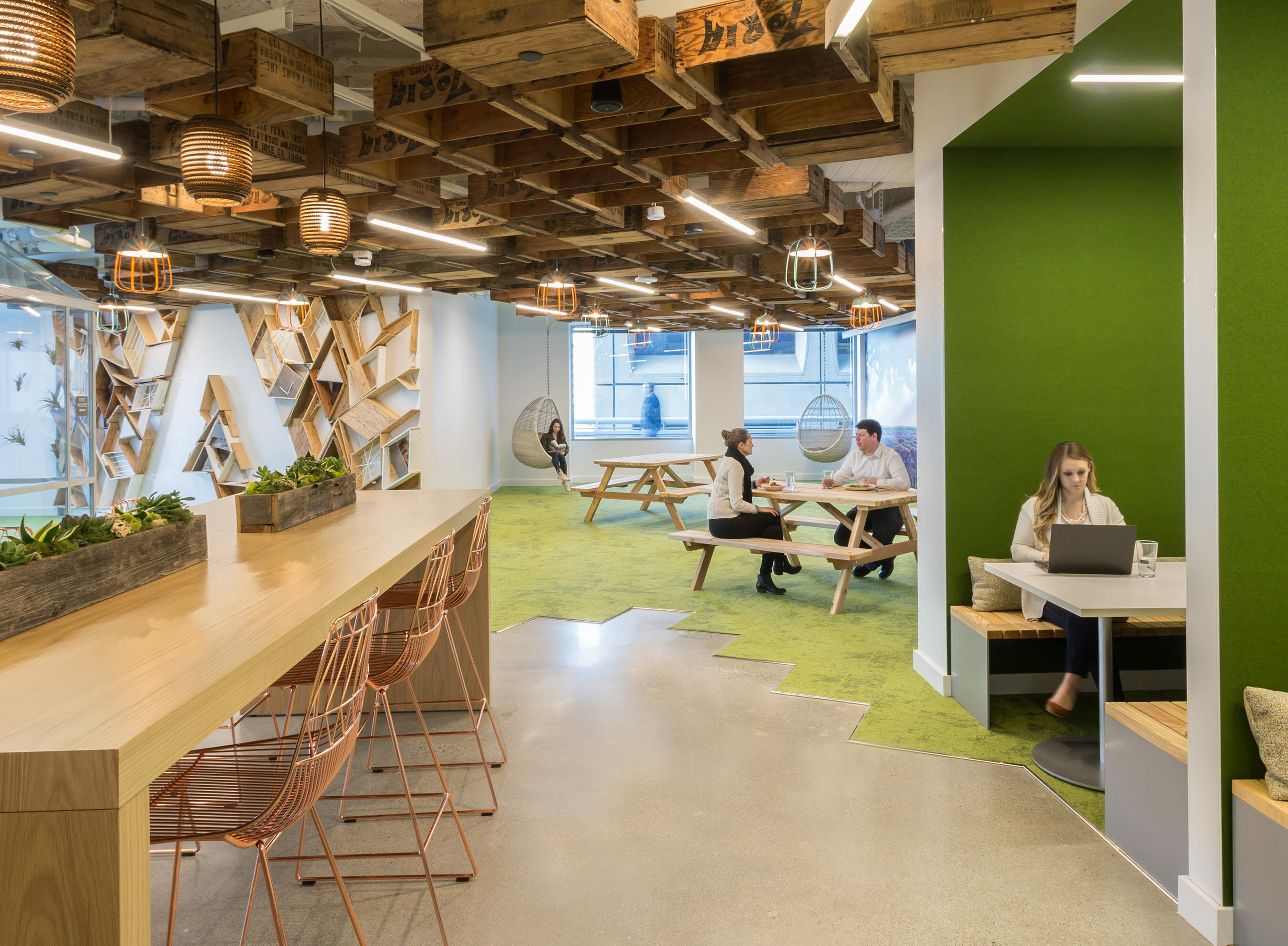
Make a Difference. Adobe has strong local ties and supports the community through a number of different programs and initiatives. Gensler engaged local creatives for artwork and sourced local materials, inviting the community in. Alluding to San Jose’s agricultural past, locally sourced fruit crates were used to create a canopy in one of the dining areas. A local artist was brought in to create an Adobe “A” art piece using the leftover crates and salvaged materials found throughout the site. We also furnished four “living rooms” in the main employee town hall with furniture from local makers. We looked at how Adobe connects to community organizations and how we could design the space to facilitate relationships like the company’s work with Girls Who Code, a nonprofit organization that aims to support and increase the number of women in technology.
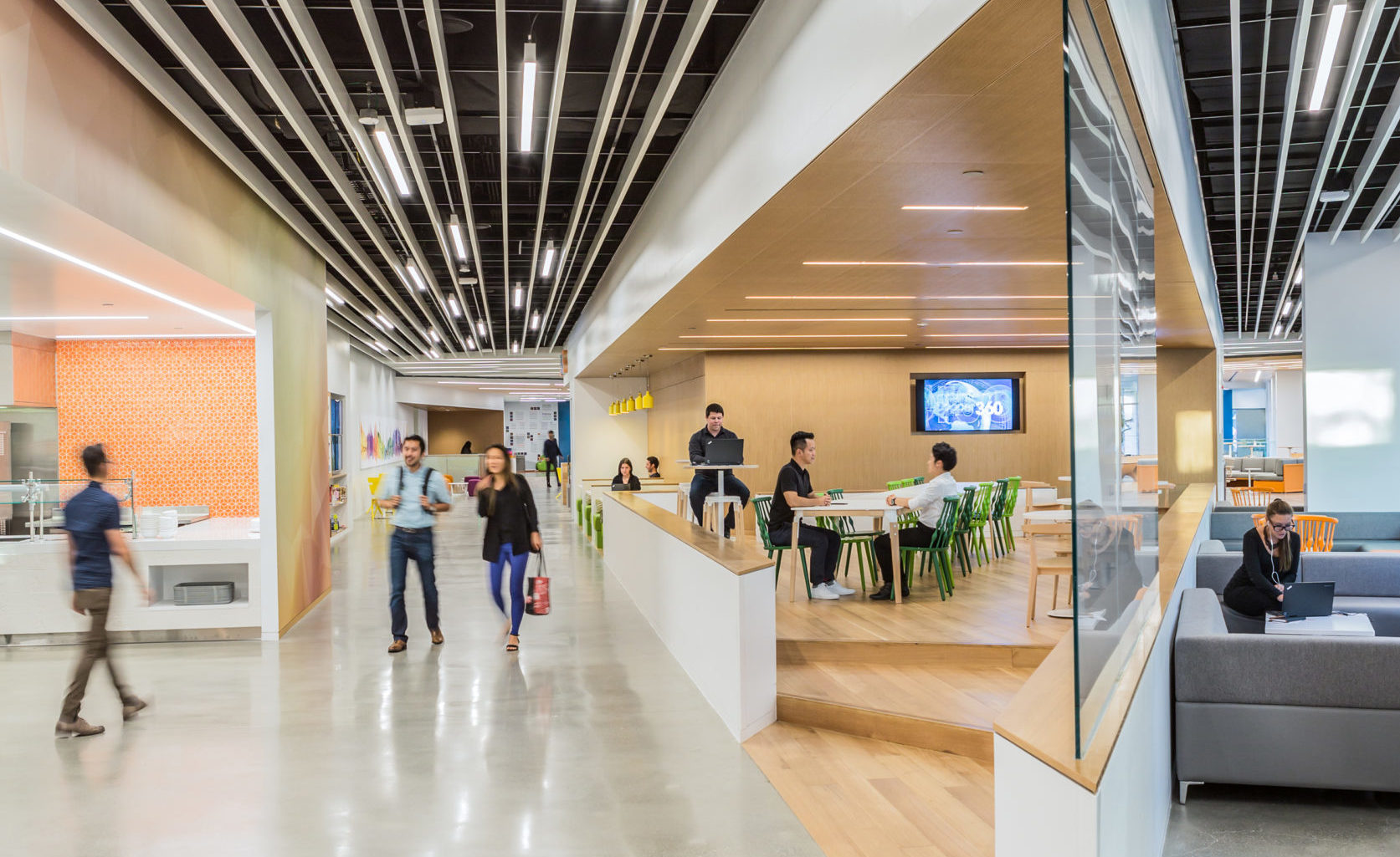
Holistically Healthy. The ability for employees to work well, eat well, play well, and live well is essential to Adobe’s culture. Gensler designed cafes that support Adobe’s affordable, healthy food options and a wellness center with a spa-like feel to empower employees to participate in the fitness and health programs offered. The wellness center focuses on overall well-being, incorporating both physical and mental activities. The spin rooms and functional training equipment provide high-energy movements, while the meditation and massage rooms provide a space to escape. The campus’ three cafés cater to its diverse workforce. The café serving sandwiches and coffee is peanut-free, while a larger restaurant focuses on locally sourced ingredients, more health-conscious food choices, and vegan options. The largest café embraces a diverse palette with global dishes that use authentic ingredients. Educational displays, graphics, and detailed menus inform employees about what they’re eating, where the food is sourced, what’s in season, and where food waste ends up.
Connected to Nature. A strong connection to nature was a priority for Adobe. Gensler created outdoor spaces, opened up views to outdoors on the work floors, included amenity spaces and back-of-house areas, as well as incorporated biophilic properties throughout the space. At the exterior patio, the Gensler team met the challenge of turning a rarely used open seating area — that was exposed to the elements and dwarfed by the surrounding buildings — into a usable and inviting space by designing a custom trellis which gives a sense of human-scale, maximizes seating options, and provides shade from the sun and protection from the wind. Festoon lights, heaters and speakers were also added to make the space more inviting. On the 6th floor outdoor space, a vegetable garden flourishes and is tended to by Adobe’s Garden Club. The majority of dedicated workstations are located along the perimeter with views to the exterior. Moss walls and air plants are important design elements in the community spaces, while smaller potted plants are incorporated into other spaces, all tended to by a local plant vendor. We designed diverse work environments that provide both places to hide away or places to be surrounded by activity while still being able to be productive.
Part of Something Bigger Than Myself. Adobe’s employees are encouraged to connect with the larger community within the company, promoting collaborative thinking across disciplines and departments. Together we created The Hive, a space for employees and the community to come together to solve business problems using design-led thinking. Adobe has a wonderful culture of Adobe Community Clubs, groups of people helping to create unique experiences and add detail to spaces from art in the cafés to tending the community gardens outside. Each club adds to the Adobe culture and helps make each individual feel they belong. The shared spaces around campus create ample opportunities for clubs and community to gather and engage with the overall space.
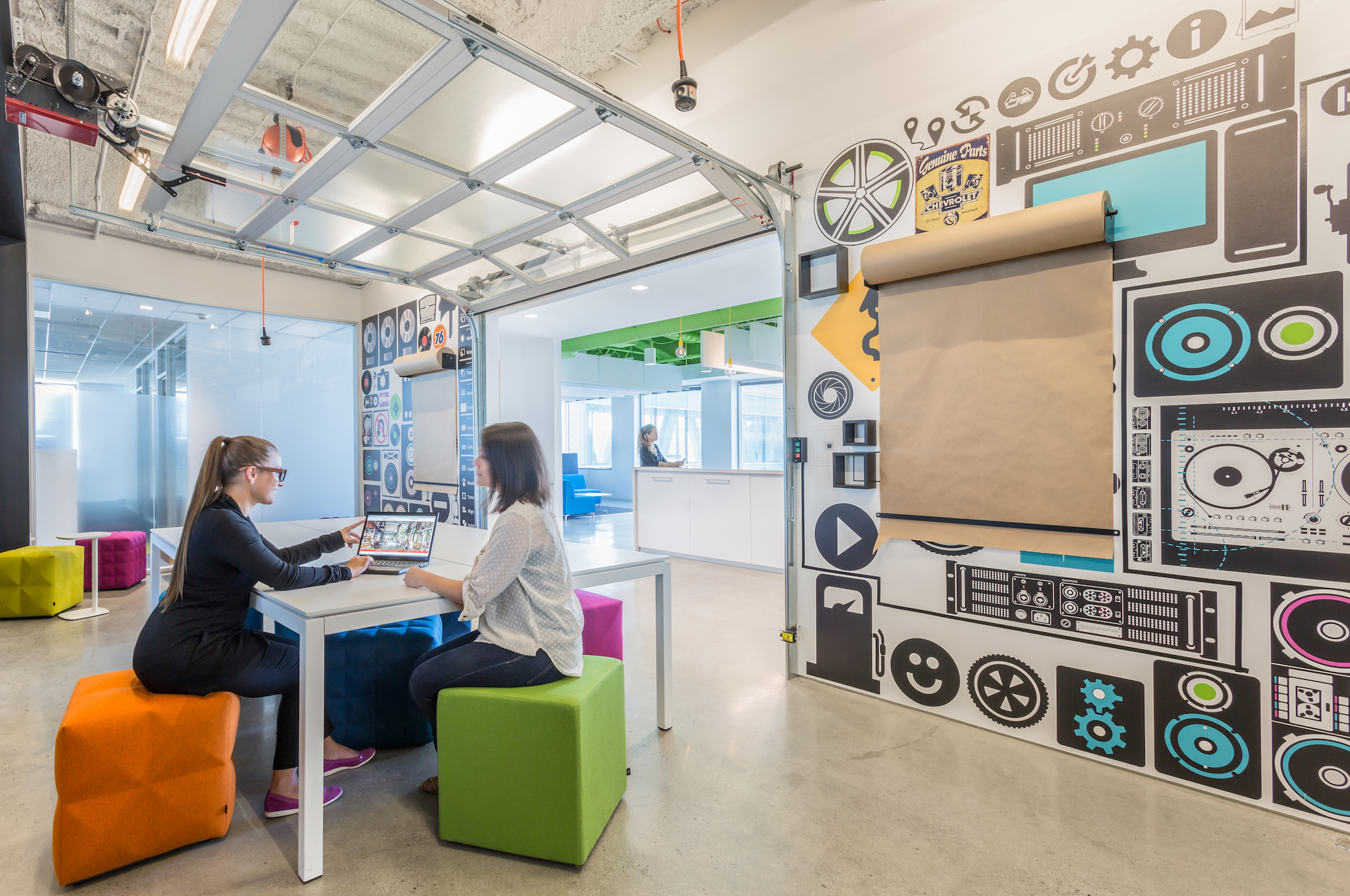
Focused and Fulfilled. Adobe loves collaboration but they know that focused work is necessary as well. Options for heads-down work, including library space, one-on-one rooms, phone booths, and focus booths, were included throughout. A dedicated portion of enclosed rooms are bookable 1-2 person rooms with video conferencing. They’re equipped with video conferencing, power, and all the proper equipment to maintain productivity. Each work floor has booths located in the break rooms as an alternative place to focus away from your desk. Unique in a corporate setting, the Library space provides a large space for individual focus time for many people at once.
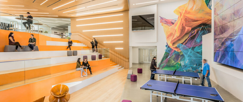
Empowered and Autonomous. For Adobe, prioritizing individual space and group space is key. Allowing people to work anywhere on campus lets people be in control of their day and lets them be their most productive self. The transformation of Adobe’s campus provided over 40,000 square feet of new places to work, collaborate, and be productive. The employee lobby, which houses its largest café, a coffee bar, the Adobe Store, tech café, and multiple living rooms offers all types of spaces to work, collaborate and connect. Private dining rooms located in the cafés provide an opportunity to meet and dine at the same time. The employee lobby also houses the main all-hands area with a two-story tall digital screen, with the capability to host various events from local vendor fairs, health fairs, holiday events, and much more. In addition, all cafes have the capability to be converted into all-hands spaces or host events.
Balanced and Happy. Adobe wanted to build fun and happiness into the entire campus. We created spaces for rejuvenation that include a massage room, group meditation room, and an individual meditation room with a stand-alone Somadome pod where individuals can rest and recharge. Creatively designed Adventure Rooms provide a completely different environment to meet, while still maintaining the basic functions. Equipped with video conferencing, a table, and power, the Adventure Rooms typically also include a game or fun activity. But the main employee lobby hosts the majority of games. After grabbing a cup of coffee or afternoon pastry, employees can enjoy a game of pool, ping pong, or foosball in the large community space.
Good Design is Good Business
Adobe wanted spaces that were meaningful, differentiated and buzzworthy. Spaces that would inspire Adobe’s San Jose employees to take to social media and post their daily experiences using the hashtag, #adobelife.
The partnership between two design-focused and creative companies resulted in a campus reimagined; one that impacts the everyday experience for employees and visitors alike and expresses the next generation of the innovative workplace.
Across campus, raw and refined elements are folded into spaces that cultivate and connect a community, all referencing back to Adobe’s breakthrough software. The design incorporates vector elements – crisp, sharp edges, paths, and scalability – to create a linked campus that is the company’s brand manifested in physical form. The spaces are unified by clean lines, defined angles that create visual pathways and the intentional scaling of each space for its intended purpose.
By investing in the work environment and creating programs that support the well-being of employees, companies like Adobe can lay the groundwork for more productivity, greater innovation, and create a competitive edge. The duality of company practices and space make this work what it is. These spaces go beyond being for Adobe, they are Adobe.

